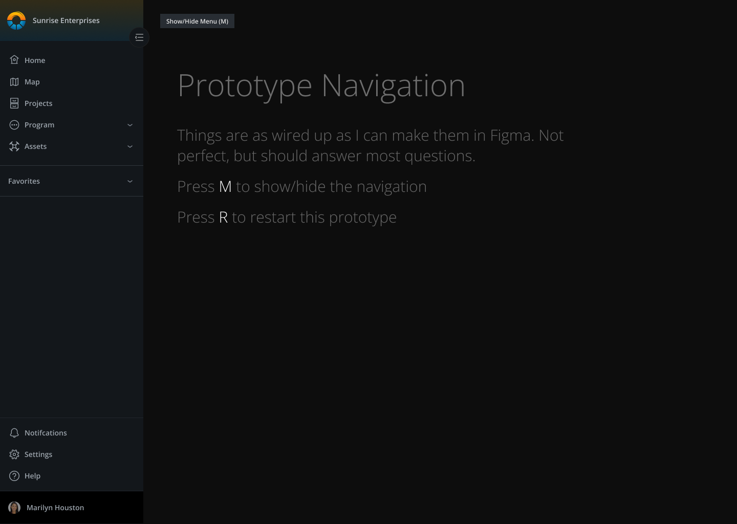
Skyward Web Navigation
Lead design for the rebuild of the web platform navigation
Design Goals
The navigation of the web platform was long overdue for both a UX and UI update. The design goals were determined by synthesizing needs from product, design, and user research.
I’d been begging to take on this task for too long and I was thrilled to finally get to head it up.
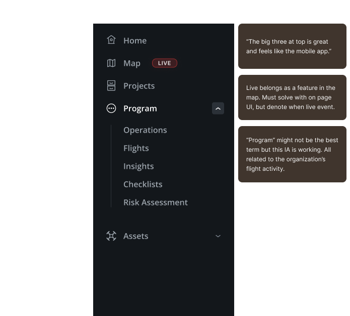
Update the information architecture
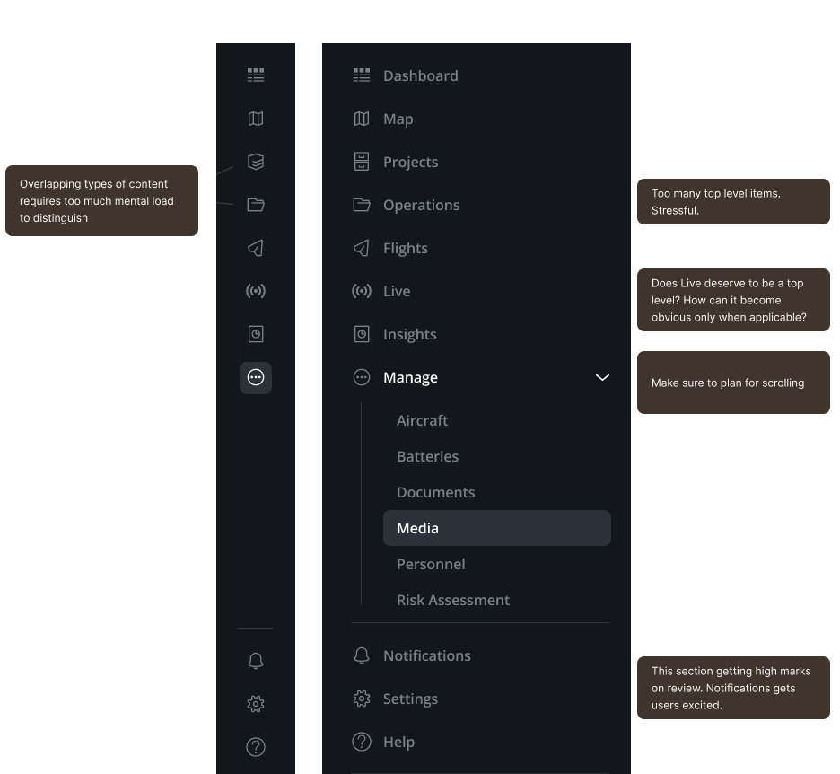
The original four top level items expanded to seven as new capabilities and workflows were built. Eight counting the logo as the link to the dashboard. Users deserve more guidance and access to their most common needs.
Better responsive solution
There were many challenges for the current navigation across responsive environments. Pictured above is the biggest challenge for desktop users. With seven items, the break point was at 1079px, far lower than common standards.
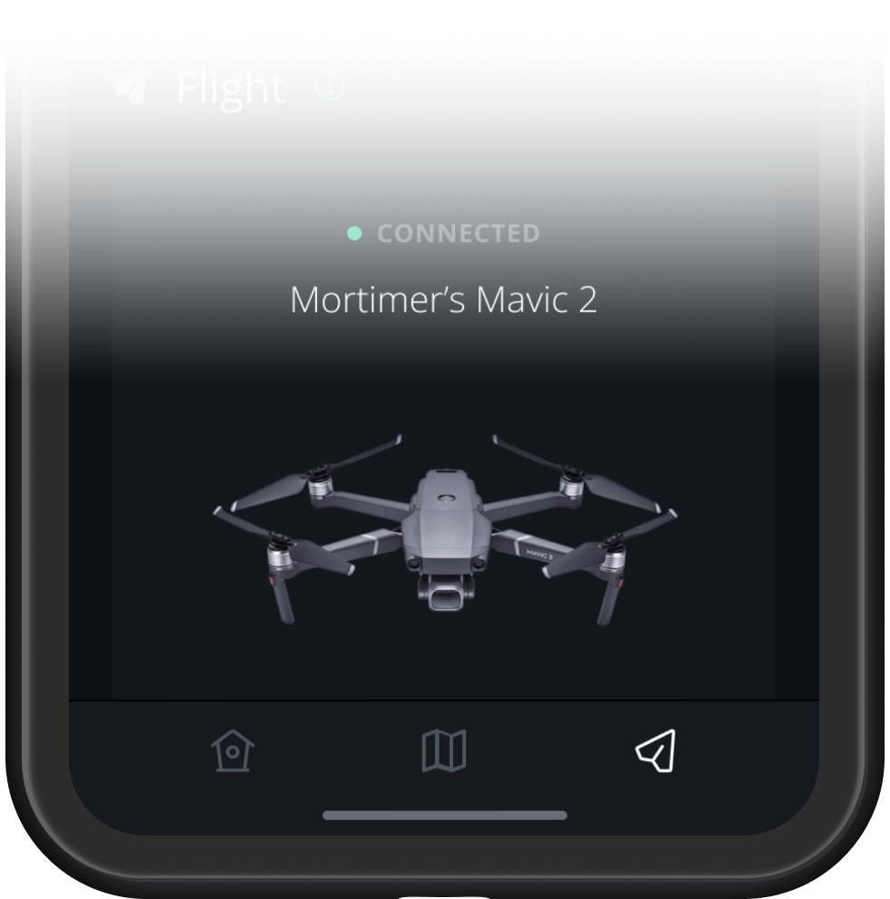
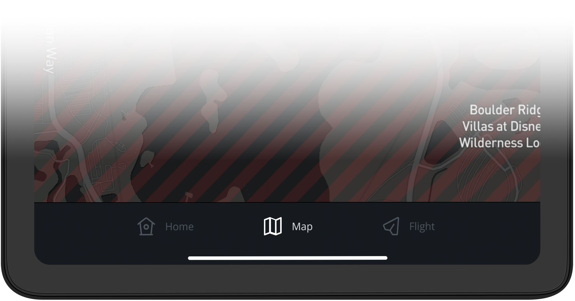
Align UI with new mobile app
The recently redesigned mobile app featured a simplified navigation in dark mode. The web experience was a stark contrast to that.
Active flight tab on a phone
Active map tab on a tablet
Modernize and Expand
Prepare for expansion with additional future features. Maintaining a consistent top level hierarchy is desired
Modernize the user experience for a modern SaaS application
Destroy tech debt – Skyward was originally launched with Angular framework, and that continued to be a thorn in our side. It prevented even minor updates. This cleared the way for a fresh build.
Research
A project of this importance and longevity deserved deep and meaningful research. I presented product leadership with a plan and budget, and was able to secure the requested time and resources to complete it.
Quantitative
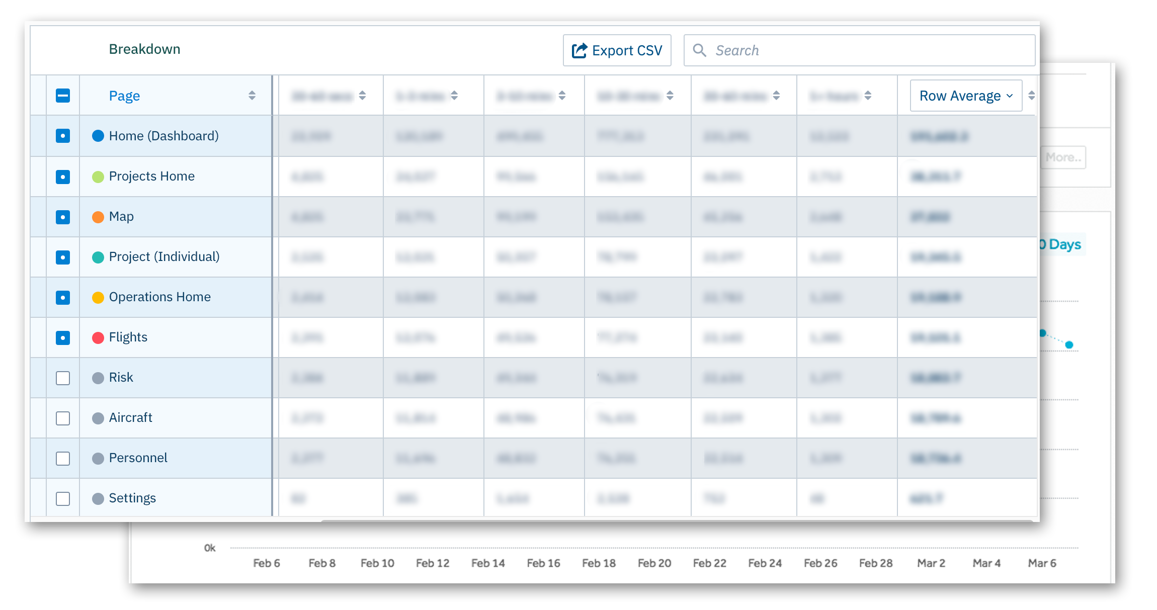
We used internal analytics tools and data from Amplitude to understand our users patterns.
Most popular pages?
Most common user paths?
How long were users spending on each area?
Interpretation was used to account for biases given the current design and IA structures. After all, the landing page after login (Dashboard) is going to have the most views.
Qualitative
I created a user research plan and then worked with customer success to identify four clients that represented the majority of the rest of our user base and use cases.
Since I’d wanted to work on this project for so long, it was a real joy to speak to users and let them know we’re finally working on it.
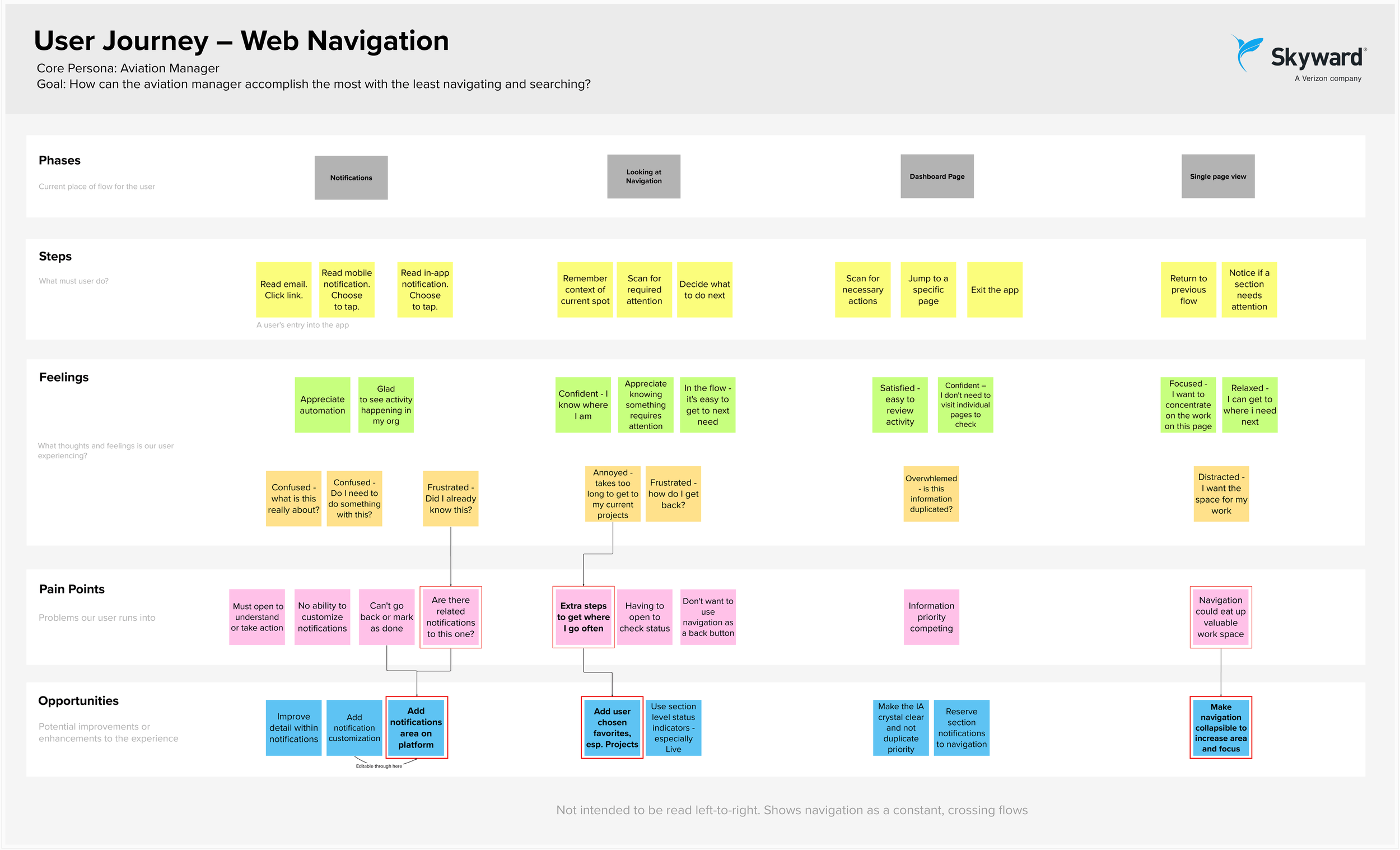
I wrote a summary document of the findings. I also created a user journey map to highlight some of those feelings in a visual format.
The user journey also helps us focus on the feelings the user is having while interacting with the platform. Designing for feeling often leads to good design decision making.
Key Takeaways
Notifications
Users wanted an area for notifications in order to feel confident that they:
Were not missing last-minute changes to the day’s operations
Don’t have to find and manually review the project/operation in question
Could review previous notifications
Customize what notifications they receive
While notifications may be table stakes for a modern SaaS platform, this specific feedback from users helps justify the cost of building the feature.
Focus
The current navigation distracted focus by being too large, non-strategic use of color, and always on.
Users are often working with a map and a sidebar of content. The navigation encroaches on their working area.
Some users stay on a single entity (page) for long periods of time. They don’t need to interact with the navigation at all.
Organization focus
Everything in Skyward happens inside an organization. Many users belong to multiple organizations.
Users requested to have this more clearly displayed to ensure they were in their desired company context.
Favorites
Some users were spending a month or more on the same project. They were frustrated that there was no way to easily return to this specific project when returning to the app.A method to make frequently used or favorite entities would be most welcomed at the navigation level.
Existing Research + Materials
Like other designers I’ve worked with, I have a tendency to want to use only fresh research, and create new UX pieces to solve the problem. There’s often so much to be gained from related work and different perspectives. Especially in a navigation project that will span all features.
So I always check-in with the team to review any existing work that may offer valuable insights. This simple step can save days, if not weeks of effort. In this case, there were lots of synthesized pieces that contributed to the design phase.
Semantic ontology map created by Leah Brady
Engineering Exploration
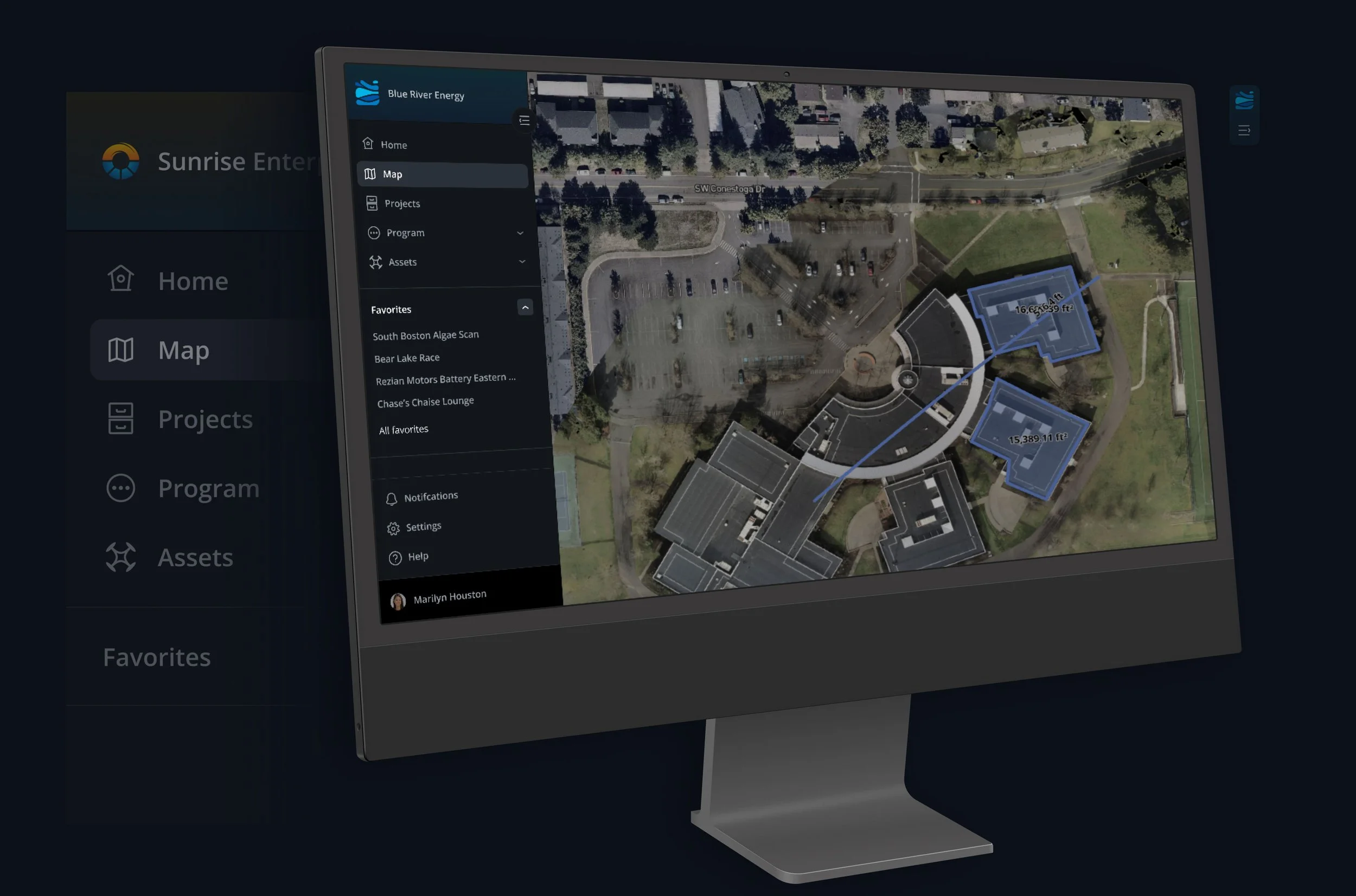
The navigation rebuild needed to support the existing platform with minimal planned disruption. Primarily, the right sidebar needed to remain as it exists.
Incorporating business constraints helps focus effort on launching, as opposed to creating churn around ideal, yet unlikely to get built concepts.
Some great group discussions (always better when it includes tacos 🌮) with the engineering and product teams led to adopting the “Side 2” approach. The proposals with a top area were strongly considered, as they offer a lot of potential functionality, but the engineering effort was too large to take on.
The design team agreed that “Side 2” type approach allows for the greatest task focus, and meets the request for maximum screen usage while working on tasks.
User check-in
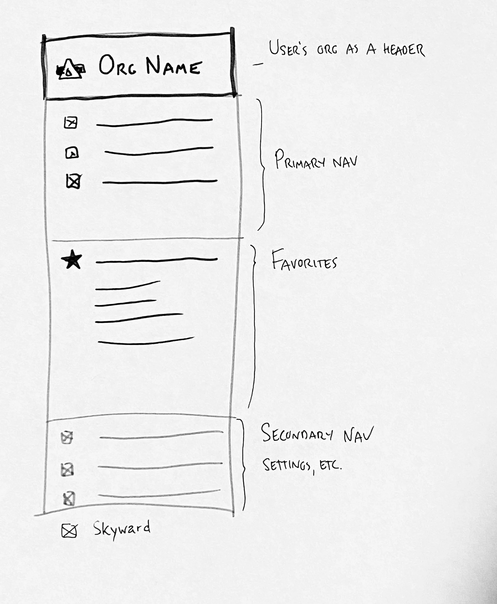
At this point in the process, I like to do a low commitment check in with the users that I interviewed. I email the summary document (no names) and a rough sketch with some notes.
This effort is so valuable as often times users will have additional insight even though they were already interviewed. It also builds the relationship and encourages future interviews. As a thank you, I’ll try to send lunch (more tacos never hurt 🌮)
Nav Structure
Combining our research with dominant web patterns, I sketched out the basic structure of the navigation.
Our enterprise users stressed the importance of clearly knowing which organization they were working in.
I wanted to not only make this clear, but give the user a sense of ownership over the software. They’re not focused on using Skyward, they’re focused on doing what they need to do for their company.
So I prioritized putting their organization at the top of the navigation. Everything else feels contextual to that dominant piece, like it flows down. Plus it makes for great screenshots, which one user told us was important.
Design
I made the choice to jump directly into high-fidelity design for two reasons:
It matters in the context of a navigation. It hits different to see it laid out compared to a text list of menus.
Figma makes it ridiculously easy to do so. With just a little time setting up components and variables, it then takes roughly the same amount of time to explore as other methods.
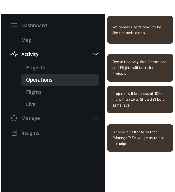
Exploring information architecture with UI
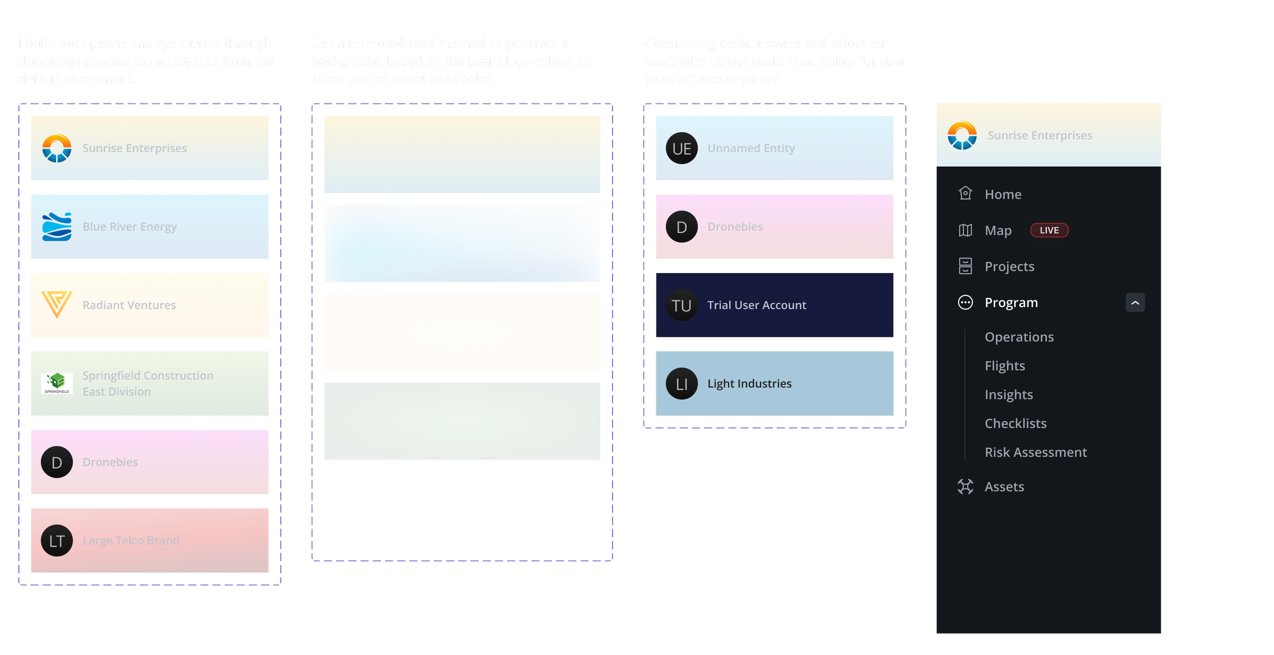
Organization Header
The Organization header is some prime real estate - top left. Therefore, it definitely warranted some production value to help earn that spot, as well as to get separation from the navigation items. Since it’s the user’s company, they should feel like it is their tool and they are proud to use it.
Adjustments from testing
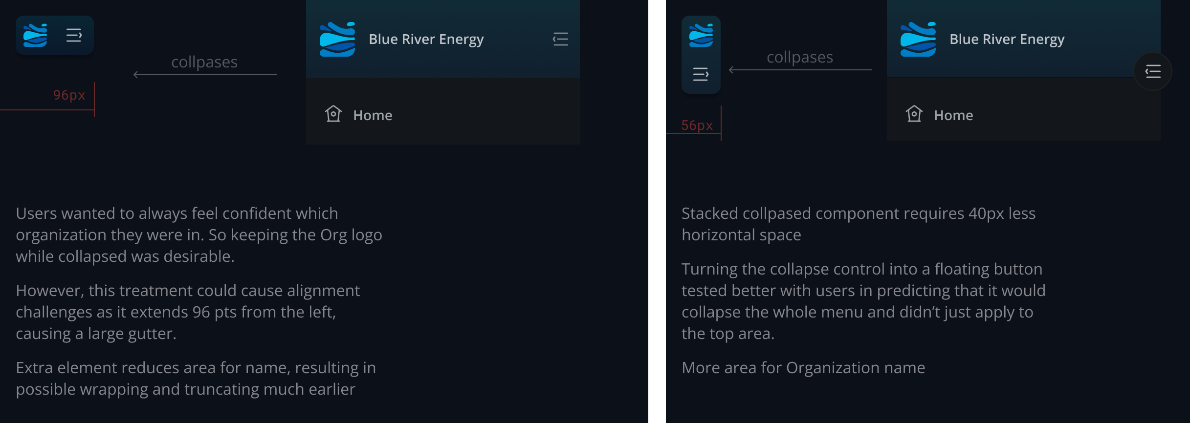
Org logo was shifted left to center-align with the nav icons. Case of visual alignment over pure mathematical or formulas.
The double-arrow was dropped as having an affordance to open the org section was causing questions as to affordances for other behaviors.
A menu collapse/expand component was created to better prepare the user for the action.
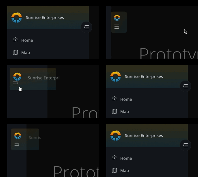
Animation testing
Results
It would have been transformative, I’m sure of it. Unfortunately, this project was in process when Verizon decided to exit the drone space and sunset Skyward. Had we implemented this navigation a year earlier, there’s no doubt it would have turned the entire business around ;)
Client
Skyward
Project
Web Navigation
Platforms
Web
My roles
User research
UX / UI Design
Documentation
Design System Integration
Collaborators
Leah Brady — UX strategy
John Fahey — UX / UI
Brandon Kitajchuk — Front-end lead

